Blog One: Raising Cane’s Website Evaluation
The website I chose to evaluate is Raising Cane’s. I did not know what to expect as I don’t frequent websites for food chains, but I was pleasantly surprised by the visuals and organization.
Visual Approach
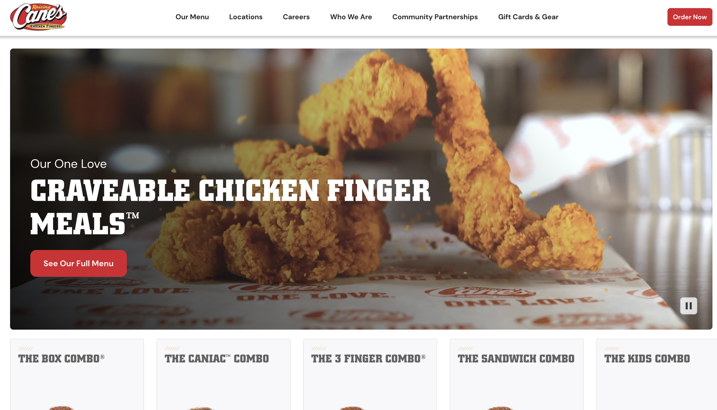
The homepage greets you with a high-quality and well-shot video on a loop showcasing Raising Cane’s chicken fingers. They incorporate graphics, a gallery of photos, and video to engage the user.
They use hierarchy well with different-sized headings. Only two to three fonts are used and are consistent throughout the site. The primary colors are white, tan, black, and red; red is used frequently as an accent color.
As you drag your cursor over the menu options on the homepage, they are spotlighted with a red background. The menu scrolls from left to right, which is not obvious at first glance.
Further, consistency of quality is lacking as some of the photos are grainy and pixelated. There are photos that are very high quality, but others look as if the file size was compressed.
An element of the homepage that stood out to me was the map of the United States with all its locations dotted across it.
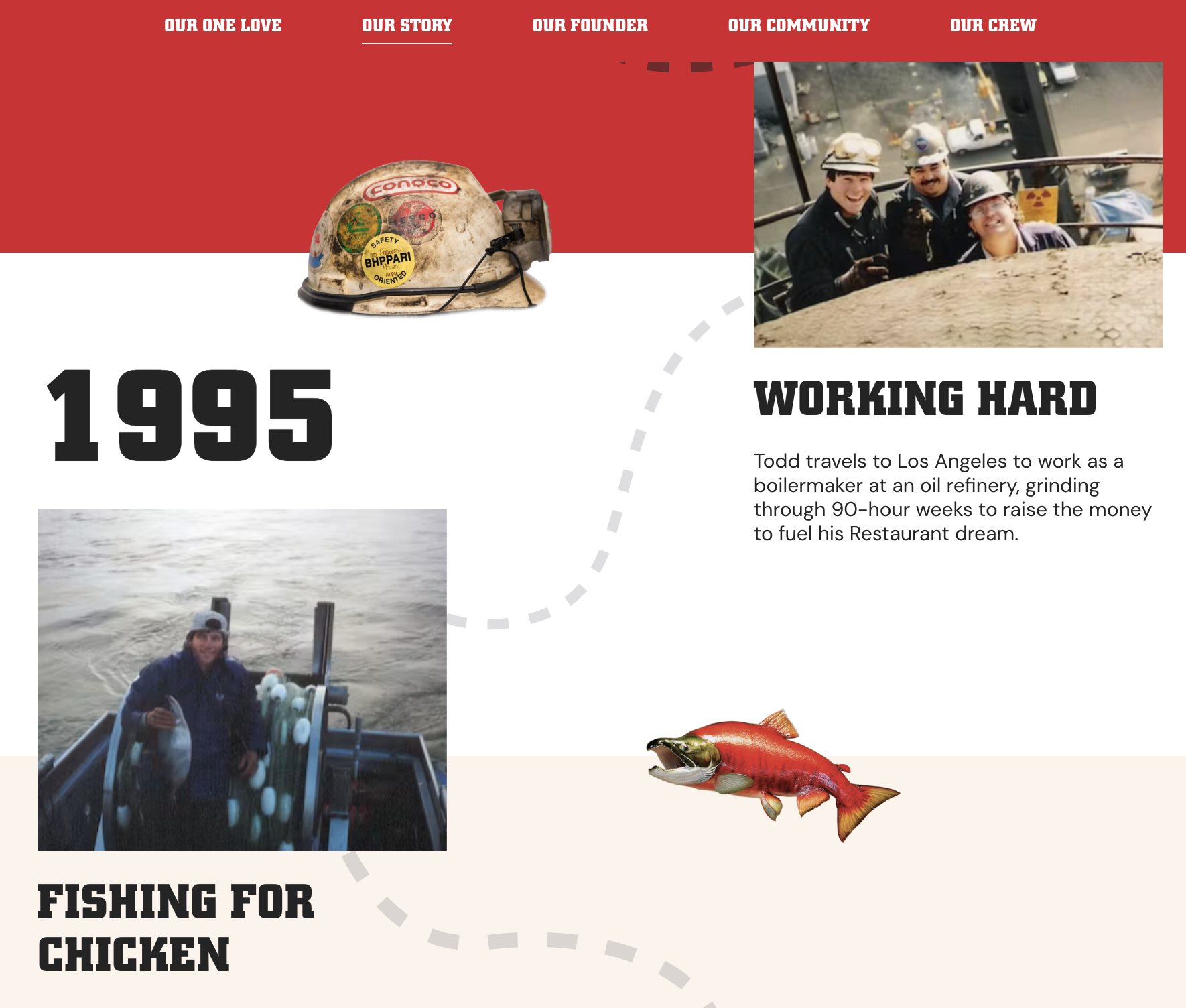
I also really liked the “Who We Are” page. It was very visually appealing, guiding the user’s eyes down the page with its “map” theme.
Overall, each block on a page is organized and has a good balance of text and photos.
Navigation
Their navigation buttons are centered at the top and are divided into six categories– Menu, Locations, Careers, Who We Are, Community Partnerships, and Gift Cards & Gear. As you scroll down the page, the navigation bar sticks, allowing for a better user experience. All links work and load quickly without any glitches. Each navigation menu links to the same page except for “Careers” and “Gift Cards & Gear.”
The “Menu” and “Who We Are” pages have anchor points so that the user can quickly jump to a specific section by clicking on the heading.
There is not an explicit button to go back to the homepage, but if you click on the logo in the upper left corner, it takes them directly to it.
Conclusion
I would rate the website an 8/10. The visuals are clean and fit their branding perfectly, and the navigation keeps accessibility in mind. The website could be improved if every photo was in high quality.